CASE STUDY
Redefined the App Homepage for Growth
A full end-to-end product design case demonstrating how data-driven decisions, iterative testing, and strategic design led to proven business impact.
CHALLENGE
From Underperforming Homepage to Engaging Entry Point
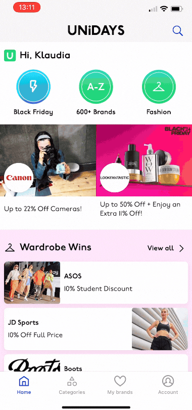
The homepage was under-performing. Users primarily relied on keyword search to find specific brands, resulting in low engagement and infrequent returns. The goal was to redesign the homepage to encourage users to explore more content and return to the app regularly.
MY ROLE
End-to-End Product Design for App
I led the full design process — from research and definition to delivery and post-launch validation — collaborating with product, data, and engineering teams to align user experience with measurable outcomes.
Platforms: Android and iOS.
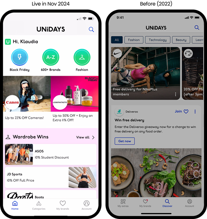
Before & After Comparison. Highlights key user needs addressed in the redesign.
IMPACT
Measurable Growth Through Better Discoverability
- +2% Week 1 return rate
- +1.98% engagement uplift
- +352% competition entries
- +25% journey engagement and +18% conversion uplift
- Individual features achieved up to 91% conversion rates
Delivered to a global audience of 225M+ users across platforms.
APPROACH
Understanding the Problem
I analysed existing data and conducted quantitative (survey) and qualitative (moderated user testing) research to understand how users engage with the homepage as a starting point for key journeys.
Users faced several discovery challenges:
- Confusing information architecture. Many questioned, "Where is the homepage?"
- Lack of brand visibility. Users struggled to see how many and which brands offered discounts.
- Cluttered experience. Non-essential content—polls, videos, large images, and detailed descriptions—distracted from core actions.
Framing the Problem & Strategy
I analysed existing data and conducted quantitative (survey) and qualitative (moderated user testing) research to understand how users engage with the homepage as a starting point for key journeys.
Defined a clear problem statement, aligning user pain points with business objectives.
Formalised Jobs-to-Be-Done (JTBD) and core journeys to guide the design process.
Synthesised user research insights to prioritise key user needs and pain points.
Developed actionable design requirements focused on navigation to four key destination types, aligning with business objectives.
Collaborated with stakeholders to establish success metrics, ensuring the solution's impact could be effectively evaluated.
Facilitated a prioritisation workshop using an Impact-Effort Matrix with engineers to confirm feasibility and focus on high-value areas.
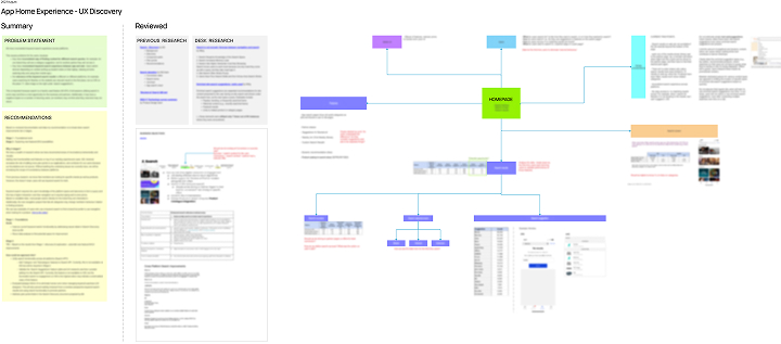
Project Mind Map. Outlines all factors influencing success, including reviewed documentation and recommendations.
Exploring & Prototyping Solutions
Business needs. Replaced the single feed with themed sections, creating a more flexible and scalable framework. This allowed for future experimentation with reordering and new sections to test what resonates most with users.
User needs. Prioritised relevant content, removing elements with little impact on discoverability (e.g., polls, videos). Designed smaller, cleaner tiles aligned with user expectations. Introduced multiple new components to reduce repetition and enhance engagement.
Minimum Viable Product (MVP). Collaborated with developers to deliver a fast, high-impact homepage update, ensuring value for users while accelerating time to market.
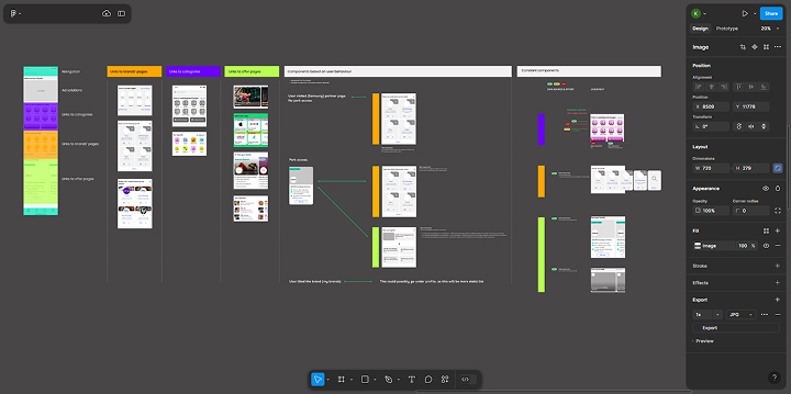
Early Component Mockups. Initial Figma designs showcasing homepage elements. Used for UI iteration, documenting design decisions, and facilitating team ideation and prioritisation.
Testing, Iteration & Impact
Usability Testing & Feedback. Qualitative research confirmed the new design improved user experience. Users appreciated the clear sections and smaller tiles, which made finding relevant content easier. The flexible, scalable structure also created new business opportunities.
Implementation & Impact. Redesigning the entire homepage complicated A/B testing. The initial test introduced too many changes, obscuring results and causing unexpected metric declines. This led to discussions with stakeholders to define key growth-driving metrics versus low-risk ones. A refined A/B test with clearer focus delivered significant results, leading to a full rollout.
Final Thoughts
The project’s success came from deep user insights, user-friendly design, collaboration with stakeholders, a solid UX strategy, and a holistic view of business success.